(Last Updated: July 10th, 2018)
Where are things at after 6 years of research?
We Gathered Data From The Top Ranking Websites, Across Five Industries (Legal, Storage Units, Dentistry, Pest Control, Construction), In The 50 Largest Metros Of The United States.
Key Takeaways
- 381% more backlinks on average to top ranking landing pages in 2018 vs 2016.
- The average number of reviews on Google for top local ranking sites are up 30% from 2016.
- The average Google page speed for mobile on top ranking sites is up 15% from 2016.
- 72% of all the searches we performed had local pack ads showing on mobile.
- 31% of top listings had questions on their GMB profiles while only 9% of top listings had answers.
It’s been six years since we published our research on what it takes to be a top dog in your local market. We decided it was time to do it all over again two years ago to see how much had changed since the first study. Well, it was time again. We spent the last few weeks refreshing the study to see how sites are stacking up in 2018.
We looked at five different industries and what they were all doing to get that coveted top spot in the local pack. We added in some new data points that are relevant to 2018 (i.e. local map packs ads, the 2-1 clustering effect, Google Posts, and Google Q&A’s).
Don’t worry, the original two studies in all their glory are still included on this page. You can find it at the bottom. We also did a study completely focused on local landing pages for law firms.
2018 Study Update
The topic of conversation for the last two years has been around link-acquisition, reviews, and Google Business Profile features, and it shows.
For links, we saw a 381% increase in the number of backlinks pointing to top ranking landing pages.
For reviews, we saw a 30% increase in Google reviews and an average of 15 reviews on Facebook and 13 reviews on yelp for to ranking sites profiles.
For Google Business Profile we are starting to see people using the Q&A’s feature, but there is a lot of room for improvement here. There are more questions being asked than answers being giving. 31% of the top listing had questions whereas only 9% of top listings had answers. This shows an area where improvements could easily be made by paying attention to what is happening on your GMB listing.
It is important to note that 68% of mobile searches had local pack ads showing up in the local results as well as 23% of desktop searches. Back in February of this year, Dr. Pete found that 35% of mobile searches had local pack ads. In just four months we are already seeing that number closer to 70%. If you haven’t already looked into local pack ads, it is time to take them seriously.
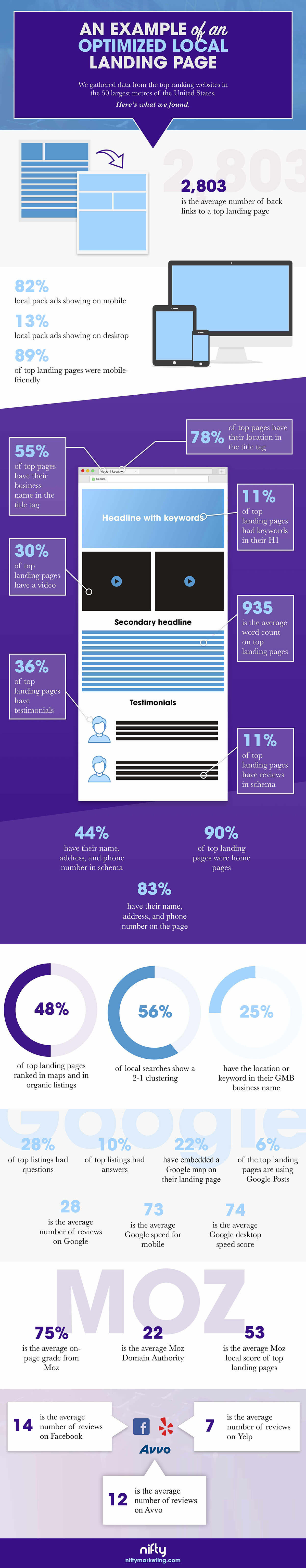
Statistics Pulled From New The Infographic Above.
86%
of top landing pages were mobile friendly
76%
of top landing pages were home pages
76%
of top pages have their location in the title tag
72%
have local pack ads showing on mobile
66%
of top landing pages have their business name in the title tag
58%
have the location or keyword in their GMB business name
48%
of top landing pages ranked in maps and in organic listings
42%
have their name, address, and phone number in schema
38%
of local searches show a 2-1 clustering
37%
of top landing pages have testimonials
31%
of top listings had questions
25%
of top landing pages have a video
25%
local pack ads showing on desktop
17%
have embedded a Google map on their landing page
10%
of top landing pages have reviews in schema
9%
of top listings have answers
7%
of top landing pages had keywords in their H1
5%
are using Google Posts
6,651
is the average number of backlinks to a top landing page
653
is the average word count on top landing pages
76
is the average on-page grade from Moz
70
is the average Google speed for mobile
69
is the average Google desktop speed score
54
is the average Moz local score of top landing pages
39
is the average number of reviews on Google
25
is the average Moz Domain Authority
15
is the average number of reviews on Facebook
13
is the average number of reviews on Yelp
Data from the 2016 study
Ready To See What We Can Do For You?
Contact UsStatistics Pulled From New The Infographic Above.
86%
of top landing pages were responsive designs
80%
of top pages have their location in the title tag
77%
of top landing pages were home pages
77%
of top landing pages have a type of call to action
76%
of sites have a click to call phone number
65%
of top landing pages have their business name in the title tag
53%
display their company’s awards and trust symbols
49%
of top landing pages have a local photo
44%
of top landing pages have a form
38%
have the name, address, and phone number in schema
34%
of top landing pages have testimonials
31%
have a photo of staff
27%
of header images is of a staff member
26%
of top landing pages have a video
24%
had links to sites to review their business
21%
have embedded a Google map on their site
21%
have a direction button or text
90%
of top landing pages were responsive designs
11%
of top landing pages have reviews in schema
10%
have parallax image or video background on the page
8%
of top landing pages had keywords in their H1
8%
of forms have a captcha
1382
is the average number of back links to a top landing page
761
is the average word count on top landing pages
94
is the average Google user experience score
72
is the average Google desktop speed score
62
is the average Moz local score of top landing pages
61
is the average Google speed for mobile
30
is the average number of reviews on Google
4
is the average number of form fields
C
is the average on-page grade from Moz
Original landing page study from July of 2012.
Every website has landing pages. Every local landing page has certain traits. But there is nowhere that explains what pieces of information are important and where that information should go to reach a higher ranking. That was until now.
What we’ve done is gone through and checked over a hundred different landing pages from many different types of businesses, including the food industry, the automotive industry, insurance companies, and other SEO firms, to find what most people were doing. We then complied a list and put it in infographic form so it’s easy to digest.
You’re welcome internet. We did it out of love.
We’re also proud to be a part of the launch of a very talented new brand, Avalaunch Media, who took all of our hard data and turned it into the sexy little number you see below. It rocks. They rock. Check ’em out.