When researching multiple law firm website designs on the inter-web, I noticed that many contact forms appeared to want too much information, had no disclaimer, or had a disclaimer that was hard to understand. When reviewing top seven lawyers of a major metropolitan area, only two of the seven lawyers listed had disclaimers on their contact page. Only three of those businesses had an actual contact form for clients to fill out and send back. This was alarming to see, as I believe contact pages should have a form fill option as well as a disclaimer! It is a good place to inform prospective clients “the information transmitted is not considered an establishment of an attorney/client relationship”.
Why don’t these firms include a contact form and/or disclaimer? Could these businesses exist in a state where a disclaimer isn’t required? Is this a lack of knowledge on part of the lawyer and their SEO Specialist? Here are some helpful tips on how to clean this up so that prospective clients turn into new and returning clients.
Contact Forms
This area is like the Yellow Brick Road between new customers and putting more money in your pockets. If this area is broken and un-engaging, customers will feel turned off and will try to find someone that fills that void. The last thing you want is to not have the prospective client feel like they’re submitting information as if they were filling out a job application or trying to get a new credit card. In other words make sure your forms are short and sweet! Include the following for the best results:
- Name
- Phone Number
- Best Time to Call Back
- Additional Comments (Incident Information)
Although some lawyer’s don’t all agree on the value of contact forms, that value actually exists. (Many believe that contact forms push a prospective client away because the time between when they enter their information and the firm getting back to them is way too long. They see this as an area that needs to be checked daily, if not multiple times through out the day.)
And while I disagree with their dislike of having a contact form onsite, they can make the form completely responsive by having it alert their smartphone or their assistant’s phone that a form has been filled out. People anymore need and want to be responded to quickly. Without this type of attention, prospective clients will just go on to the next business that will give them the time of day.
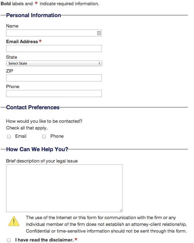
The contact form below is of one I found and really like. It’s not too demanding for the prospective client to fill out but still they are able to give enough information to either warrant help or not. Especially pleasing was the disclaimer note that was included below the form itself. Letting people know about the attorney/client relationship is key, but also requiring them to click that they have read the disclaimer I think is a good idea. Me personally, I would have included the word “understand” in “I have read the disclaimer” check box but that’s my honest opinion.
Disclaimer
This can be tricky as with contact forms, many of the websites viewed only included one disclaimer on only one page and sometimes there wasn’t a disclaimer at all. Now this may be ok in the eyes of your basic SEO manager, but for your own protection a disclaimer should be on all pages that include any legal information and not legal advice.
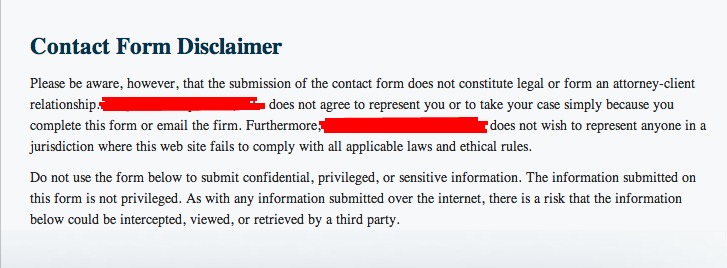
The most important thing I’ve seen is that you have to let readers know that any content onsite is and only is “legal information” and should not be held as legal advise from the lawyer. Another important factor is data submitted via a contact form is NOT seen as confidential information. On top of that, just because there was some sort of communication established between you and whoever responded to your contact form, doesn’t mean an attorney/client relationship has been formed. Misleading any prospective clients is a great way to loose online appeal too. (Reviews for business listings online are increasing in volume and this way of “word of mouth” could destroy those companies who may be involved in providing misleading information.)
Referencing this message will save you from any future headaches. Don’t think because that disclaimer isn’t included you’re automatically safe. The last way you want to appear to customers is inherently misleading. See an example contact form below.
Each state will have a different set of rules when concerning the placement and content of your disclaimers. Some states prohibit a firm from making statements that might give a reader or prospective client misleading information on a result of a case or particular types of cases. In the states where this applies, information containing “results aren’t typical” should be included in your disclaimer.
For example in California, under Rule of the California Rules of Professional Conduct
Rule 1-400(D)(4) “the attorney’s communication or solicitation must clearly, expressly, or by context indicate the information is merely a communication or solicitation, so the viewer does not misconstrue the information as a legal relationship or legal advice.” And in Texas, Under Rule 7.04(q) of the TDRPC, “every disclaimer or disclosure must be presented with equal prominence, legibility and in the same manner as the content on the website being disclaimed or disclosed so the viewer’s expectations are not mislead as to the attorney’s skill and the results the attorney can achieve.” You’ll want to check your state’s bar association and professional conduct rules to see if your website is meets all of their requirements.
The legal field has become highly competitive. See that you are responding to phone calls and form fills as soon as possible and make sure the disclaimer you have attached is clean, readable, and understandable!
Keep posted for more, as this is series 1 of 7 I’ll be doing on “The 7 Areas Lawyers Overlook on Their Website”.

Mike Ramsey is the founder of Nifty. He is the author of Winning At Local Search and a former partner at LocalU, which provides beginner to advanced conferences in the realm of local search marketing. Mike founded Nifty in 2009 which has been recognized by Inc. as one of the fastest-growing companies in America.


