Chances are that when you’re planning your law firm website, the color scheme isn’t your highest priority. You want the site to look nice, of course, but when you think about the core issues such as building trust and conversion, you probably aren’t thinking about the psychology of color.
You should be.
When I started working on this post, I Googled different types of law firms in cities of varying sizes in different states around the country and looked at their color schemes. Since you’ve seen law firm websites before, you probably won’t be particularly surprised by what I found.
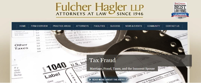
A general practice firm in Augusta, Georgia:

A corporate law firm in Chicago:

A criminal defense law firm in Lexington, Kentucky:

The Standard Gray Law Firm Website with a Splash of Blue
Creating a website in these standard law firm colors is a safe bet in some regards. Gray makes a good background color for nearly any other color, because it fades readily into the background and lets the accents take center stage. And, blue offers some general benefits for any website:
- Pretty much everyone can see blue, while red/green color-blindness is fairly common
- Blue is the most common favorite color for both men and women in the United States
- Blue is psychologically associated with trust and confidence
So, what’s wrong with all those gray and blue law firm websites? They’re overlooking one of the most important principles of marketing: know your market.
The Psychology of Color and Your Law Firm’s Market
Blue and gray may make be a good combination for many businesses. Since the combination evokes feelings of stability and trust, investment firms, insurance companies and similar businesses may do well to gravitate toward these colors. The same may be true for some law firms–those operating in similar arenas, where stability is a key motivator for their target markets.
However, the target market for that type of law firm differs significantly from the prospective client base of a criminal defense attorney, a personal injury lawyer or a family law firm.
It’s worth your while to think through the impact various colors will have on your particular market before choosing your color scheme. Numerous studies reveal the significant impact that color has on decision making. This KissMetrics infographic shows the results some companies achieved by changing only the color of their call to action (CTA) buttons—in one case, a 21% increase in conversions.
The Best Colors for Your Practice
Finding the most powerful colors for your legal website requires an understanding of two key elements: what your market is looking for from you and what each color conveys to your visitors.
The first question, you can answer based on your own experience and the image you hope to convey. Are you offering stability or a good fight? Generations of knowledge and good reputation or a fearless willingness to confront powerful entities? Do your clients come to you looking for peace and reassurance or for a fierce advocate?
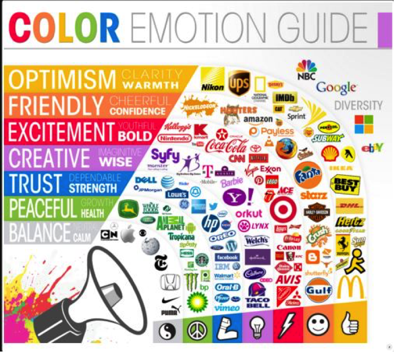
The second is readily answered by extensive research, and neatly summarized here by The Logo Company.

Incorporating Color Professionally
Of course, one of the reasons that so many law firm sites incorporate understated colors like blue and gray is that they’re striving to make a professional impression. Taking advantage of the psychology of color in your law firm web design doesn’t mean that you have to abandon a dignified look or splash your site with showy colors.
These firms have strategically incorporated effective colors into their web presence with relative subtlety.
Green is the color of growth, and in the United States we associate it with money, so it’s a great choice for this Washington, D.C.-area banking and financial services firm:

Likewise, these two consumer sites (a national consumer bankruptcy site and a California personal injury law firm site) make judicious use of orange, a color that probably doesn’t spring to mind as an obvious choice for a law firm website, but which is viewed as both friendly and confident:


If you’re skeptical about the difference those small color choices may make to your practice, look back to that KissMetrics infographic that showed a 21% increase in conversions when one business changed nothing but the color of its CTA buttons.
Your CTA button is not the place to be discreet. In addition to the emotions associated with particular colors, it’s well established that contrasting colors perform better when it comes to conversion. In the personal injury site example above, you’ll note that in addition to the strategic use of orange to create a positive association with the firm’s attorneys, the call to action button is yellow—a color that doesn’t appear anywhere else on the page.
Using color to guide your visitors’ impressions of your firm and increase the likelihood that they’ll make contact doesn’t require a full artist’s palette or a mix of vibrant colors. In fact, for many law firms that would convey the wrong message entirely. The key to finding the right color combination for your firm’s site is to understand the general impression you want to convey to your visitors and then use the appropriate colors strategically to encourage action.
Curious to know more? Check out our portfolio of websites to see what we can do for you. Also, check out our page on law firm website design to better understand what your site needs to stand out from the crowd.
Devin is the Director of Product at Nifty. With over a decade at Nifty, and even more years working in the SEO and digital marketing space, Devin has done it all – from execution to high-level strategy. He is a Google Product Expert and speaks French fluently. In his spare time, Devin enjoys fishing, playing pickleball with his wife, and cheering on his kids from the sidelines.